&! Past Layouts
What was wanna-be.net's previous layouts?
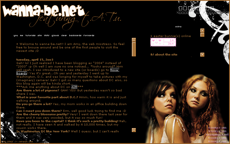
 Version
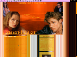
One: Featuring t.A.T.u.
Version
One: Featuring t.A.T.u.
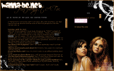
Yeah, mind the colors. This was the first version of wanna-be.net so I decided
to keep it simple. I wanted t.A.T.u. because they were my favorite at the time.
Try not to notice how poor the colors are if you want to click on it to expand
it. Oh yeah, about the fonts and stuff, I thought it was pretty matching :P
But I know that the counter didn't match or look good -- I was making some layout
change. So there you go :D
 Version
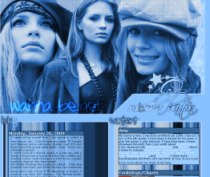
Two: Pink Explorer
Version
Two: Pink Explorer
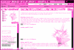
This layout was a pretty cool one :P Everyone kept thinking that the layout
was part of their Explorer. Well, it WASN'T! I made it! And where you "type
the address URL" there was a marquee that had my "loved people"
:) But I didn't keep it up long because it was getting annoying and pretty boring,
so I didn't really like it... Oh well. It was nice while I had it. But the scroll
bars were ugly and although it took me forever to change it all to make it like
that, I won't use that kind any time soon. Well, you know
 Version
Three: It's G to the C and We're rockin' MD
Version
Three: It's G to the C and We're rockin' MD
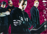
This was a Good Charlotte layout, as you can see. I don't have a large preview
avaliable, sorry! I did see that a lot of sites had that same picture of GC
from the Rolling Stones magazine.. But I had it up for a pretty long time. Hmmm..
Well that's good because it took me forever to get it up... lol.. Oh well. I
guess there isn't really much to say about this one, but I went to the Civic
Tour and that's pretty much the reason I made it :D
 Version
Four: Cruise Memories '01
Version
Four: Cruise Memories '01
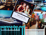
Here I made a layout out of one of the images from my cruise. There is a picture
of me next to my sister (I am in the bright dress) lol.. I don't have a large
shot of this layout, either. Sorryyy
And for this layout I got a lot of compliments lol.. Thanks! I am glad you all
liked it :)
 Version
Five: A Touch of Paradise
Version
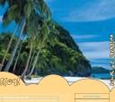
Five: A Touch of Paradise
This is basically a summer layout, lol. I thought this layout was OK.. Because
I mean I dunno.. lol Oh well. I don't really have much to saaaaaay... I didn't
have it up for long, but that's my problem. I maybe had like 2 blogs in that
one, and I didn't update it much... I was busy on my other sites. Well, I still
don't know what to say haha.. But I like the OC layout waaaaaay better than
this one, and I am glad I did a layout change.
 Version
Six: I Love the OC
Version
Six: I Love the OC
Yay!!! lol Perfect summer layout. I had it August, so it was up for about a
month. As you can tell I love the OC, lol.. By the way it's a show if you didn't
know. Well this one had Summer, Marissa, Seth, and Ryan featured in it...
blah blah blah I don't know what to saaay.. I liked it for a while but you gotta
admit it got pretty annoying, rofl. Well I changed the layout, but it is still
the OC because the OC rocks socks and it always will. LONG LIVE THE OC!!!!
lol...
 Version
Seven: Another Season of The OC
Version
Seven: Another Season of The OC
This was probably my favorite layout so far. It's kinda plain but hey.. I thought
it was nice. rofl, like my blog? Anyways, I kept this up for the beginning of
Fall kinda, I mean the colors were fall-ish. My favorite part of the layout
were the pictures of them on along the side, haha. It was a bootiful layout.
Well that's all I gotsta say, haha. Another OC layout. I LOVE TEH OC!
 Version
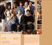
8: Mischa Barton
Version
8: Mischa Barton
Of course another OC layout! Well, kinda. This one featured Marrisa of
the show, the OC. Basically it was just a few pictures of her blended together
and faded blue. Haha, I had it since like the fall and I'm sure many people
got annoyed of it... Yeah I did, too. It was cute though!! I liked it, heh.
It did take me a while because I didn't know what to make it look like, but
yeah there you go.
<-- back
 Version
One: Featuring t.A.T.u.
Version
One: Featuring t.A.T.u.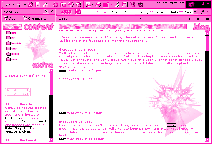 Version
Two: Pink Explorer
Version
Two: Pink Explorer